I love long cards. This one is 4″ x 8 1/2″ and fits in a business size envelope. I cased my Very Punny Frog card. The original layout was from my downline Christi, who send me a gorgeous New Year card with her family pictures in the little squares.
I really enjoyed making the last card and decided to make another one with the same set and limited color. I finally broke open my Primas. They are soooo pretty! But I had a hard time finding matching SU paper.
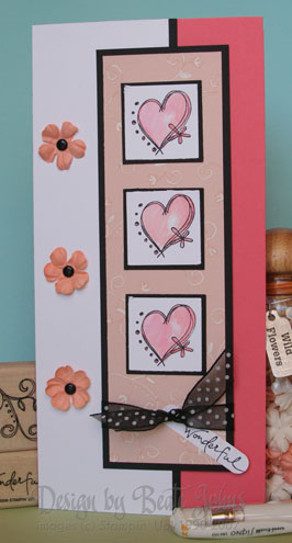
Again I used the flourish from Doodle That to stamp tone in tone on Blush blossom cardstock. I then highlighted it with the white gel pen. The card base is Cameo Coral. The saying is from the stamp set Warm Words. The hearts are stamped with Black Stazon on Whisper White, colored with Blush Blossom and Cameo Coral and aqua painter and then punched out with the 1 1/4″ square punch.
Beate
6 Responses to “Doodle That BIGGER IS BETTER”
Sorry, the comment form is closed at this time.


LOVE this, Beate — The colors are wonderful!
Another beauty! I love the crispness of the black and white with the pink….Very elegant!
Color combo is awesome and I love how you used that set for this card!
Beautiful colors and a really simple layout, this card is awesome! The primas look adorable!
Beautiful! Love the color combination on this. Very nice.
Very nice card, I love the colors and how you painted them. I’ll have to keep practicing to see if I can accomplish that technique….