
Jun 302007
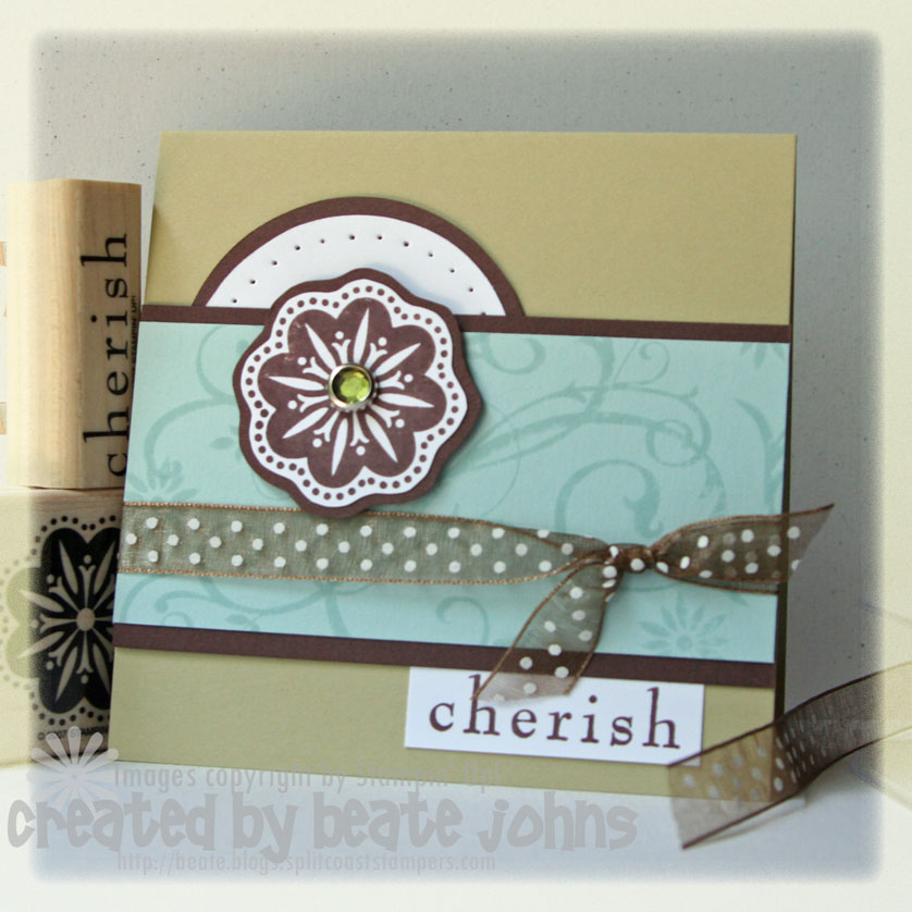
After seeing my Baroque Motifs card from yesterday on my blog, I thought the proportions were a little off. So when I stamped it again, I started with a 4 1/4″ x 8 1/2″ piece of River Rock cardstock folded in half. The Soft Sky cardstock piece measures 2″ x 4 1/4″, the chocolate chip cardstock 2 1/4″ x 4 1/4″. The rest of the card is still the same.
I like it better this way. We will be going to the beach today. I haven’t been there for like 3 weeks and miss it like crazy. Hot sunshine, warm ocean water and white, fine sand….what more can you want? Okay….a cooler full of diet coke, but that I will have! Have a wonderful afternoon.
Beate
19 Responses to “Challenge card revised”
Sorry, the comment form is closed at this time.


Beautiful card. I just love this set and can’t wait to place my order from the new catalogue (which my demo just brought yesterday). Thanks for all your inspiration – I love your work. I hoping to start getting in on your challenges too. I did one a couple of weeks back (the Gate Fold) thought you might like to see it even though it was waaaay too late.http://www.splitcoaststampers.com/gallery/photo/586058?cat=500&ppuser=109435
and the inside: http://www.splitcoaststampers.com/gallery/photo/586059?cat=500&ppuser=109435
I loved both of them! I just love this stamp set
Your revision is beautiful as well!
Have fun at the beach! (You sound like me with my Diet Coke..ha, ha)
This is beautiful Beaty! I can’t wait to get the new colors!
I think the first one and this one are wonderful! I don’t think I’ve ever seen you make a bad card! 🙂 Enjoy the beach!
This is a beautiful card Beate!!!!
marja
Beautiful, as always!!! 😉
So pretty! Great sketch! Wish I had time to play!
Wow! This is cool! I love the dome over the Baroque thingy (medallion? flower?). I wouldn’t have thought there was anything wrong with the other card, but I guess, now that you point it out, it does look better as a square card. You have a very creative eye!
love the brown and aqua. aqua is my new favorite to stamp with. it can mix with so many colors.
LOVE this card!
Well I tried this challenge and was quite pleased with my attempt. The card was so different from anything else I have done. I did play fast and loose with the dimensions. I hope you like my interpretation: http://www.splitcoaststampers.com/gallery/photo/597159?cat=500&ppuser=2630
My scanner is also playing fast and loose with the scans. I will rescan after church
Entry #22
Beate, This is a gorgeous card. The colors, the simplicity, everything about it. I love Baroque Motifs because it’s so versatile. I’ve been playing a lot with it and each time the look is different! Thanks so much for your blog and all the great information you put out there for us stampers. You’re fabulous!
Such a versatile sketch Beate! Love how you used it on this card. Such pretty colors too!
Linda
I love it thanks for sharing
My first stime participating in your challenge. Always going to but never got around to it. Hope this link works.
http://www.splitcoaststampers.com/gallery/photo/597749?cat=8359
Entry #27
This card looks wonderful Beate!!!
I loved it!!!
Hugs from Brasil
Marcia
Love the sketch, Beate! Just got around to making my card!
http://comestampwithme.blogspot.com/2007/07/scallops-everywhere.html
Entry #42
This is such an awesome card. That Baroque Motifs is my favorite set. I just love it.