
Harmonious Sprig is another gorgeous new background from Unity. I used it to create a card for one of the Splitcoast Sketch challenges.
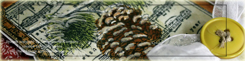
The image was stamped on Natural White Cardstock in Tuxedo Black ink and watercolored with Ranger Distress inks (Vintage Photo, Old Paper, Shabby Shutters). White Liquid Pearls were added over the pines and branch. White Organdy Ribbon from May Arts was tied around the lower half. One of my Mom’s old buttons was tied with Linen Thread around the ribbon.
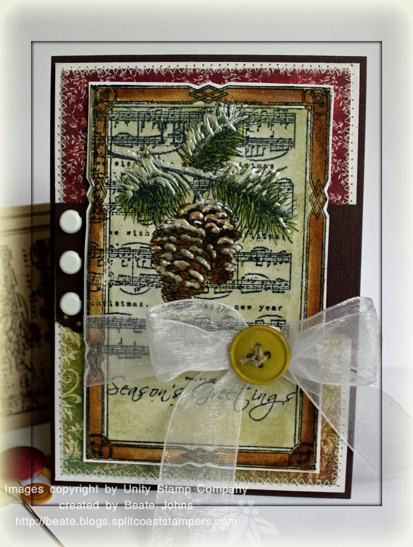
The card base is a 4 1/4″ x 12″ piece of Textured Chocolate Chip cardstock folded in half. A 4″ x 5 3/4″ piece of Natural White was layered with 1/4″ narrower pieces of Basic Grey Fruitcake and Wassail Paper. The layers were stitched together. A 2″ x 4″ piece of Textured Chocolate Chip Cardstock was punched with the Eyelet border punch and adhered slightly above the center of the card. Three white brads were added to the left of the image.
Beate
27 Responses to “Snowy Pines”
Sorry, the comment form is closed at this time.


awesome card-thank you for helping to inspire us as the holidays approach I go brain dead 🙂
Wow- What a beauty!
This card is outstanding. I love the reality of the pine cone and branch.
Beate – this card is so beautiful. The liquid pearls makes it look so 3D. Thanks for sharing! Your work is such an inspiration!
Wow! Another rock star worthy card! You always use such great supplies and in such gorgeous ways. I’d love to be a fly on the wall in your craft room!
This is gorgeous Beate!! Wow!! What a realistic image!!
So elegant!
Beate!
I am drooling over this one! OMG! That pine branch just “pops” off the card and looks soooo real! I love pine cones and love this tremendously!
Holy Cow!
Joan
Beate!
I am drooling over this one! OMG! That pine branch just “pops” off the card and looks soooo real! I love pine cones and love this tremendously!
Holy Cow!
Beate, deine Karte sieht wunderschön aus, der “Belag” auf den Zweigen ist klasse… Tolle Idee…;-) Werde ich mir mal wieder merken… Liebe Grüße, Silke
GORGEOUS card! Funny me–when I first read it, I thought it said, “Harmonious Spring”, and I was really trying to make that work with the image I was seeing…guess I need a nap!
This looks like a 3-dimensional winter scene. Just beautiful.
So stunning and elegant Beate! Love the aged look to this!
I so love that card, Beate!! Those liquid pearls make the spring image practically leap off the page!!! TFS!!
This is absolutely gorgeous Beate! I always get really inspired when I come to visit you. Thanks for that!!
Denise
Beate! This is gorgeous! Love how you added the liquid pearls for snow! Stunning!!
This card is beautiful. Thanks for sharing.
Gorgeous, Beate! Love the added details, especially the liquid pearls!
That is gorgeous! B : )
Beate, this is the most gorgeous card I have ever seen!!!I love it!!
Geri
Gosh, this is stunning! What a fabulous creation! The image is beautiful.
Stunning card Beate. Absolutely stunning.
this is gorgeous Beate! It is such a beautiful stamp and you have surely done it justice and then some!
Great vintage feel, love how the liquid pearls just pops this!
Incredible! I love how the liquid pearls make the image pop; very cool!
Wow…this is so gorgeous and so life-like!! The Liquid Pearls really add to it’s beauty!! Love it!!
Absolutly GORGEOUS!!! Love the sparkle and the music background! wow!!!