
Thursday’s Way to Challenge on Splitcoast was to use Gray on your project. Gray is the main color here in Ohio in the winter. Gray skies, gray dirty snow….. the winter was long and I can’t wait to see the first blooms to appear. So I combined my wish for Spring with the Gray challenge to create this card.
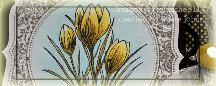
I started out stamping the Crocus image from Flourishes Year in Flowers 1 in Tuxedo Black Memento Ink on Neenah Solar White cardstock. It was cut down to a pretty small square and colored with Copic Markers (Flower Petals: Y11, Y13, Y15, W3, Leaves: YG91, YG93, YG95, Background: B0000, B000).
Next I stamped one of Gina K.’s gorgeous Lovely Labels 2 with Lightning Black Brilliance Ink. It was cut and embossed with Classic Circle and Label 15 Nestabilities dies and adhered over the image. The layers were adhered to a piece of black cardstock, cut and embossed with Lacey Square Nestabilities dies.
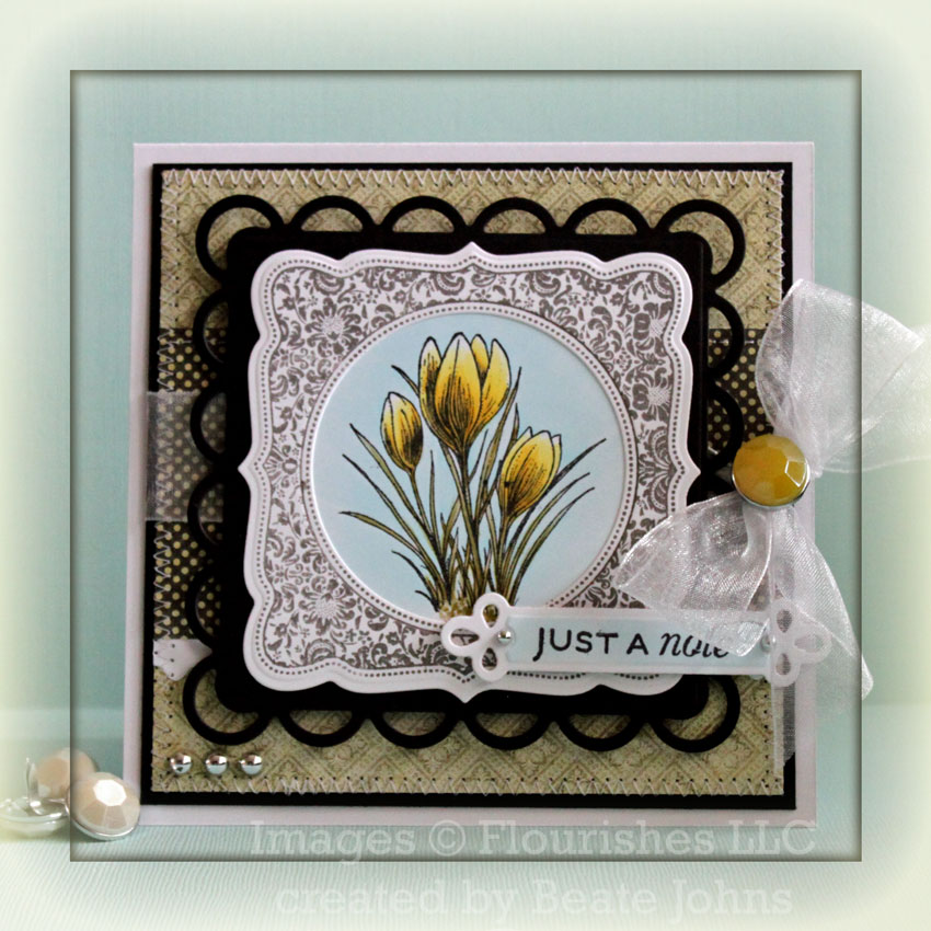
A 4 3/4″ long strip of white cardstock was cut and embossed with a Lattice Borderabilities and adhered under a 2 3/8″ x 4 3/4″ piece of Pink Paislee’s Queen Bee paper. The layers were adhered to 4 3/4″ square of another piece from the paper pack. The layers were stitched to a 3/16″ bigger piece of black cardstock.
May Arts Organdy Ribbon was tied around the horizontal layer and topped with a Queen Been Brad before the layers were adhered to a 5 1/4″ x 10 1/2″ piece of White cardstock folded in half. The image layers were adhered to the card base with dimensionals.
The sentiment is from Flourishes Tag Lines. It was stamped in Tuxedo Black Memento Ink on a piece of Neenah Solar white cardstock, cut and embossed with JustRite Stampers Exlusive Nested Sentiments Spellbinders die. Silver Recollection Pearls finish off the card.
Thanks so much for stopping by! Have a wonderful day!
Hugs and smiles
Beate
26 Responses to “Waiting for the First Blooms”
Sorry, the comment form is closed at this time.


Your crocus is beautiful! I love the
yellow accented with the black. And
your coloring is exquisite!
Oh WOW this is soooo BEAUTIFUL Beate!!! Stunning colors and WOW what a design!! Have a GREAT Monday!
your cards are always so beautiful.
stamping sue
http://stampingsueinconnecticut.blogspot.com/
It’s beautiful! I love the black elements in your cards. They give them a very distinguished look!
Another stunning creation, Beate! Your combination of stamps and dies are a knockout and your image is gorgeous… such beautiful coloring!
Such a lovely card Beate.
This is gorgeous, Beate! Stitching adds so much too. I really need to get me a paper sewing machine!
You are one of the best card makers I know. I’m such a fan of your work. This is so beautiful. Love how the main image is framed so beautifully. Love the rich detail. Best, Curt
Stunning!! Beate, you can even make black and grey look beautiful!!
Like you, Beate, here in the UK we have had a long, grey and damp winter. We need some warmth and sunshine on our shoulders to cheer us x
Wow! This is absolutely beautiful and so elegant. There’s way too much I love about it to type it all!
Fabulous Beate, love the image, love your coloring…, the bow is perfect with the brad… WOW! Hugs and happy day..;-)
So pretty. I’m going to check this evening to see if I have these shades of yellow. The brad couldn’t be more perfect.
I, too, am ready for the Ohio skies to brighten to a nice shade of blue.
This is stunning. The black really makes it pop!!
Oh wow! This is gorgeous Beate!! I just love the coloring of these springy flowers and your design with the frame. Beautiful!!
hugs,
Chris
Gorgeous card Beate! Love the black lacey square!
Just gorgeous Beate I love the colour combinations and the black lacey square really sets it off.
I wouldn’t have thought to put the lovely labels around the flower but it’s gorgeous!! What a beautiful spring card. Into my favourites this will go. As always, thanks so much for sharing.
Beth Greco
You sure know how to make gray gorgeous!
I like details and combination of colors
It is a very elegant card
hugs
Oh so pretty, such great layering of your dies and love how the yellow pops, such lovely framing of the flowers, I too can’t wait to see the flowers blooming!
Your tulips look so beautiful, and I love how the black really makes your image panel pop!! So elegant and gorgeous, Beate!!
This is just so beautiful Beate…love your coloring and the black just makes the flowers ‘pop’!!! TFS
~Terry~
sigh… this is so pretty, Beate! such an elegant color combination! love this gorgeous card!
Gorgeous card, Beate! Hope you’re doing well! Miss you! 🙂
Wow~ so gorgeous! I love every little detail!
What a lovely and stunning card Beate. Just stumbled across your blog. I’ve been a fan of your work though for a long time. God certainly has blessed you with a wonderful talent.