
The new tutorial this week is written by the amazing Yvonne Hagane. She shows us how to watercolor with Distress Re-inker. She didn’t have the equipment to shoot the video so I had to do it. While I am no expert like her ( my number one choice of coloring medium are Copic Markers), I hope it will help the visual learner.

For my sample I started out with Flourishes With Gratitude set. It’s a set you can’t purchase, but get for free once you spend $100 at the Flourishes store. I stamped my image in Jet Black Archival ink on Watercolor paper and cut and embossed it with the largest of the small Classic Oval Nestabilities dies. The image was then colored with Distress inks and Reinker (petals: Mustard Seed, Wild Honey and Spiced Marmelade Flower center: Vintage Photo, Walnut Stain Leaves and stem: Bundled Sage Reinker, Peeled Paint Background: Tumbled Glass Reinker).
The oval was put back over the watercolor paper and the image was first sponged with Antique Linen, then with Vintage Photo Distress inks. It was adhered to a piece of Textured Chocolate chip cardstock (Stampin’ Up!) that had been cut and embossed with the largest of the Beaded Oval Nestabilities dies. The edges of the image were paper pierced.
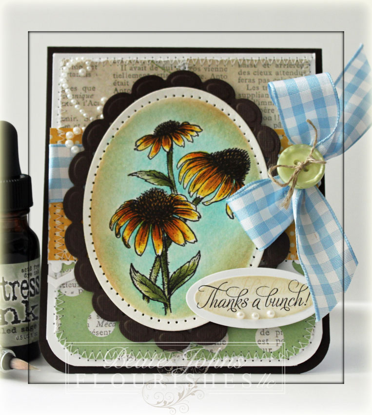
Four 1 7/8″ x 2 1/8″ pieces of MME Lost & Found Rosy Paper were cut, two of those pieces had one corner rounded and every piece had each edge distressed. The paper was stitched to a 4″ x 4 3/4″ piece of Neenah Solar White cardstock, which had the bottom corners rounded as well.
A 4 1/4″ wide white cardstock strip was cut and embossed with one of the Flower Doily Accent dies. It was stitched to a 2 1/4″ x 4 1/4″ piece of Rosy paper which was adhered over the center of the other layers. Blue Gingham ribbon was tied around the horizontal layer and was topped with a button. Part of a white Finesse pearl swirl was adhered to the upper left hand corner before the image was taped down with dimensionals.
The sentiment is also from “With Gratitude”. A piece of Neenah Solar White cardstock was cut and embossed with the smallest of the small Petite Oval Nestabilities dies. It was sponged with Antique Linen Distress ink and a different sentiment was stamped over the center with Antique Linen. The main image was stamped in it’s center with Jet Black Archival ink. Three White Baby Bling Pearls finish off that sentiment panel.
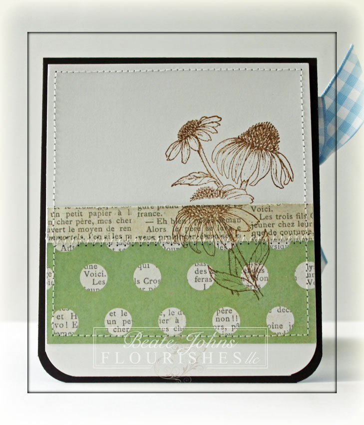
The inside of the card was kept real simple. 1/2″ x 4″ strip of Rosy paper was stitched to a 1 3/4″ x 4″ strip from the same paper (opposite side) to make a 2″ wide panel. That was adhered to a 4″ x 4 3/4″ piece of white cardstock that had the bottom corners rounded. The main image was stamped over the paper petals and insert with Vintage Photo Distress Ink.
Here is a video for the visual learner (be kind….so NOT my coloring style):
[youtube]https://www.youtube.com/watch?v=mG5OjXjkDR8[/youtube]
Thanks for stopping by! Have a wonderful day!
Hugs and smiles
Beate
22 Responses to “Tutorial on SCS – Coloring with Distress Inks”
Sorry, the comment form is closed at this time.


Never tought of drying the paper… maybe that’s why I had some much trouble and did not like it 🙂
Thanks for the tutorial 🙂
Well, I think you could color anything, any way, and it would be beautiful!! This card is gorgeous!!
OMGoodness girl…I LOVE the way this turned out. I don’t think I have enough of the TH inks to color like this. I will have to pick some more up when I move. I will try this for sure. Love your vidieos and the card looks amazing. 🙂
Hugs~
Beate-ful!
thank you for this video tutorial.
This card is beautiful.
hugs
So pretty Beate! You make these images come to life!
That card is so refreshing…love the colors! Video was perfect for me (I’m a visual learner), Never thought of using my distress inks COOL!
This is so gorgeous! There is so much dimension to it with your colouring!
There is no medium you cannot master! This is SO gorgeous Beate!!!
GORGEOUS!!!! LOVE this…might have to give it a try! Such a pretty card Beate….
Gorgeous Beate!! I love your coloring with the distress inks!! Great tutorial. Wish I had more of them. Stunning card!!
hugs,
Chris
Gorgeous card and coloring Beate! Thanks for your great video!
I LOVE the way this turned out…love the colors!
Fabulous job!! I love it. Another great tutorial.
Well I don’t know what your thinking because your coloring of the image is beautiful, and really like the sponging of the background, such pretty inside too!
Finally I have my power back from Irene. We got hit hard, but anyway I just wanted to say this is yet another beautiful project & video. Beate what kind watercolor paper do you use when doing this technique? Thank you for sharing. Can’t wait to get caught up on what I’ve missed on your site. ;0)
Traci Lord
[email protected]
I didn’t know to dry the paper! So, I’m going to try again!
Your coloring is perfect! I like the watercolor look using the DI’s. I’ve been experimenting w/DI backgrounds w/some of my Copic images on watercolor paper(I find them much easier than Copics since I don’t have the air brush). Jacki H has been coming over weekly to color. Practice is the key! Thanks for getting us coloring here in Dayton, OH.
Beate, I love everything you do and wish I could color half as beautiful as you do. Just keep those projects coming.
your coloring is amazing no matter what medium you use, Beate! gorgeous card. love how you finished the inside, too! off to watch the video!
I use watercolor pencils and crayons a lot, but haven’t tried using the inks like this. Guess I need to give it a try. thanks!
Beautiful work, Beate. Your voice is so calming, too x