
Have you ever used neutral colors to bring out the depth in one of your coloring projects? Well, let’s kick it up a knotch and show you just how beautiful your stamped creations can be without any color at all! That’s right, this challenge is to color up your card with neutrals – shades of grey, sepia tones or even black and white! Link up your Bringing Back Beautiful Challenge card here to enter. If you upload to SCS, please use the keyword BBB08. You have until March 31st to enter! As we unveil our challenge for next month, we’ll share our True Beauties – those card makers who wowed us with this challenge! Winners will be featured on the Flourishes Blog and will receive a True Beauty blog button to display proudly on their blog!
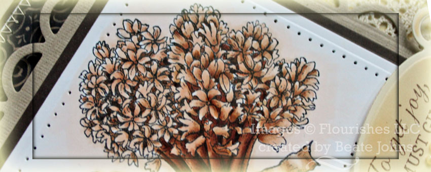
For my sample I decided to try my hand on a Sepia card. I had already tried black and white on this and this card. I stamped an image from Flourishes new stamp set Hyacinth in Tuxedo Black Memento Ink on Neenah Solar White cardstock.
The image was cut and embossed with Classic Square Nestabilities die and colored with Copic Markers (E0000, E29, E30, E31, E33, E35, E37, E39). It was layered on a piece of Canyon Brown cardstock, cut and embossed with the next size Classic Square Nestabilities die and the edges were paper pierced. The layers were then adhered to a piece of Textured Kraft cardstock, cut and embossed with the largest Lacey Square Nestabilities die.
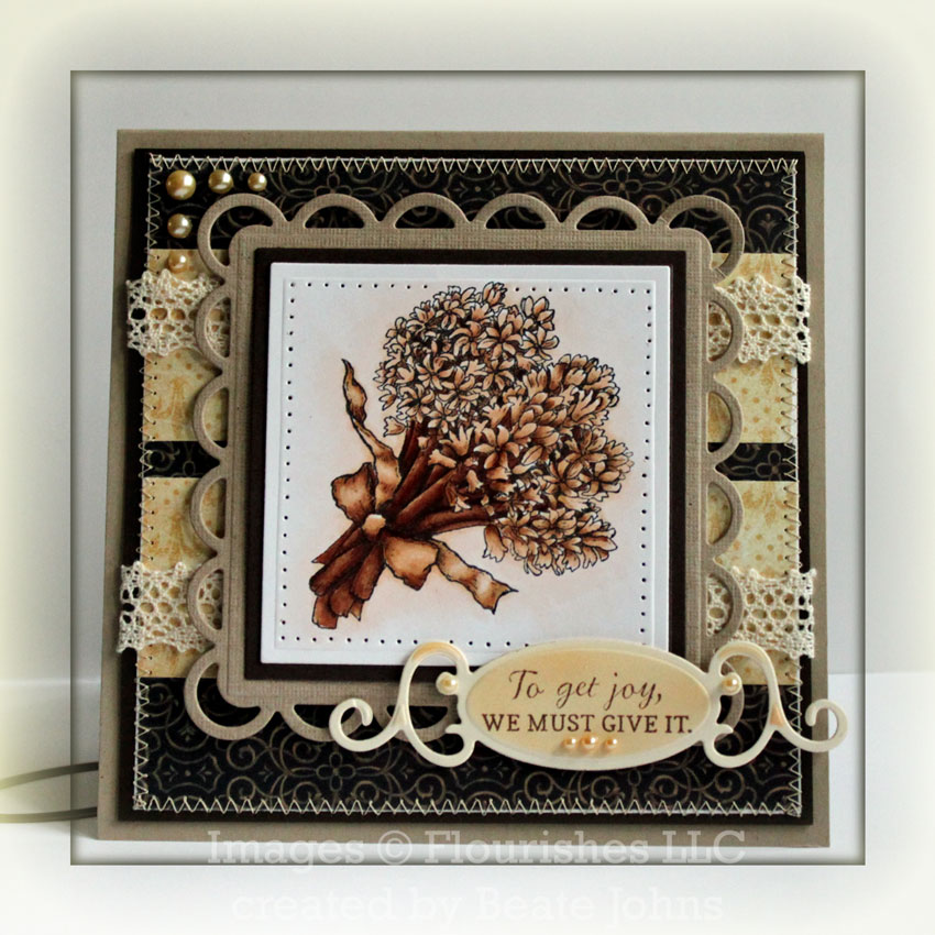
Two strips of 1 1/2″ x 5″ Graphic 45 Baby 2 Bride Patterned Paper were adhered to a 5″ square of 7 Gypsies Morocco Journey. The edges of the paper were sanded before the layers were stitched to a 3/16″ bigger piece of Canyon Brown cardstock.
Two strips of May Arts Crochet Lace were placed over the horizontal strips before the layers were adhered to the card base; a 5 1/2″ x 11″ piece of Kraft cardstock, folded in half. The image square was adhered to the card front with dimensionals.
1/2 of one of the quotes from the set was stamped in Rich Cocoa Memento Ink on a piece of Classic Cream cardstock, cut and embossed with a Fancy Tag die. The label was airbrushed with Copic Marker B30.To finish off the card Latte Kaisercraft Pearls were added to the sentiment tag as well as the top right corner.
For the inside of the card A 5″ square of Neenah White cardstock was adhered to a 3/16″ bigger piece of Canyon Brown cardstock. The image used on the front, was stamped in Antique Linen Distress ink a bit off center. The second part of the sentiment was stamped over it in Rich Cocoa Memento ink.
A 1 1/2″ strip of Graphic 45 paper was adhered to a 1 5/8″ strip of Marocco Journey paper. Both strips were adhered to the lower right of the panel before the panels were stitched together. A Stitched Lace Flower topped with a Stampin’ Up! Antique Brad was adhered to the left of the paper strips.
Be sure to check out the rest of the team by clicking on over to see…..
Thanks so much for stopping by! Have a wonderful day!
Hugs and smiles
Beate
38 Responses to “Bring Back Beautiful – Neutral Beauty”
Sorry, the comment form is closed at this time.


Beautiful! I love colouring images this way… I usually just pencil shade them!
Absolutely STUNNING Beate and your colouring is gorgeous!!!
Beautiful card! Looks stunning.
wow! gorgeousness, Beate!! absolutely amazing coloring. love love love this, girl!
Oh my goodness! This is drop dead gorgeous! I love the shades of color you used and the paper is so pretty. I like all the layers that added so much dimension. Well Done!
wowww ! Beate i love your card wonderful
hugs
Absolutely gorgeous Beate!!!
oh, my! such a beautiful piece of art to wake up to this morning. I really want to try this technique, but soooo chicken!
Beautiful card, Beate! That is a wonderful layout, and the Graphic 45 paper is perfect with your gorgeous lace panels! As always, the coloring rocks! Hugs!
Wow Beate, This is just stunning. I get so much inspiration from your blog.
hugs
Marion
Gasp! This is gorgeous. The bouquet of flowers looks amazing… The colors and designs are outstanding!
This is amazing!!!!!!
so beautiful and elegant Beate, love the colors and the wonderful spellis…HUGs
Beate, your card is just so beautiful! The softness you`ve brought to the image with those sepia colors is amazing. Well done!
Oh, how beautiful! LOVE this sepia card!
This falls in my category of unbelievable! WOW WOW WOW! Gorgeous in every detail, your colouring is beyond amazing!
Stunning card Beate! Love the Sepia look! I’ll have to give this a try! Thanks for the inspiration!
Your card is absolutely stunning! The
design is perfect and your coloring is
exquisite!! Thanks for sharing –
Gorgeous card Beate! Love that image and your coloring! The lace and stitching looks fabulous. :o)
STUNNING!! Oh Beate!! This is SO SO beautiful.
WOW!! This card is gorgeous, Beate. Layout, stitching, image, colouring…EVERYTHING…WONDERFUL!! x
This is just truly gorgeous!!!
Just perfect Ms. Beate!!! So glad you ushered this challenge. I know I would have never done this without some urging!!! Love the brown tones you used with that lovely hydrangea and all the little extras that draw it all together into one beautiful card!
Simply incredible Beate! It does not get any better than this…This is one of my very favorites that you have created….Just Lovely!
Wowser! This fancy card is so pretty with all the special touches you have added!
Picking my jaw up off the floor! I love sepia! This card is stunning!!! I bet it’s even more stunning in real life! WOW!
Beate this is amazing without the pop of color. The neutral is awesome and warm.
I love the sepia tone! I will have to give this coloring technique a try very soon!
Absolutely gorgeous.
This is amazing Beate. Your coloring skills are out of this world. I tried the “flicking” motion this time. It still dosen’t look as good as yours. LOL 🙂
Hugs~
Soooo beautiful…and restful for the eye. Love it!
I saw this at the Flourishes blog and just gasps! Gorgeous in hues of neutrals! Beautifully done, Beate!
This card is gorgeous!!!!
OH! I could just die, I love this so much! Of course, I love shades of brown, and all the depth and tones of this image just leave me breathless. Totally gorgeous, Beate!
Traumhaft schön *schwärm*
LG
Anke
Oh my that is just stunning, I just LOVE sephia, don’t know what it is about it. Gorgeous coloring and terrific layout! One of my Fav’s!!!
This is stunning! I will certainly give it a try.
Sigh…you do this so beautifully and seamlessly, it is an absolute delight to look at how amazing this is Beate! Stunning!