ocldt07rockcandybutterflywi.jpg

For yesterday’s OCL sketch challenge I got out my new set In Flight. It is so pretty.

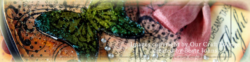
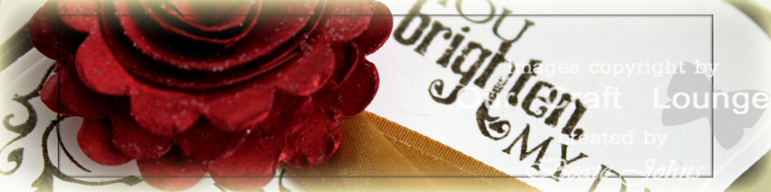
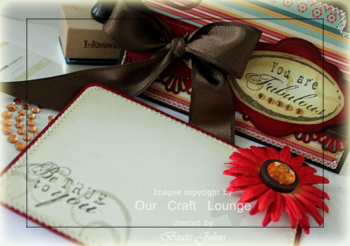
I started by cutting an oval with Petite Oval Nestabilities out of Solar White Neenah cardstock. I sponged it with Wild Honey, Peeled Paint , Fired Brick and Vintage Photo Distress Ink. I scribbled Glossy Accents over part of the oval and pressed a piece of a page from a dictionary page over the glue and let dry. Then I ripped the rest of the page off and sponged over the library piece. Last I covered the entire oval in Rock Candy Distress Stickles.

Next I stamped the dotted background and swirls over the oval in Jet black Archival ink. I also stamped the big  background in the upper center of the cardstock. I stamped it again on grunge paper. I cut it out, sponged it with Peeled Paint and Chipped Sapphire and then added Peeled Paint and Broken China Distress Stickles.

ocldt07rcbutterflybeate.jpg

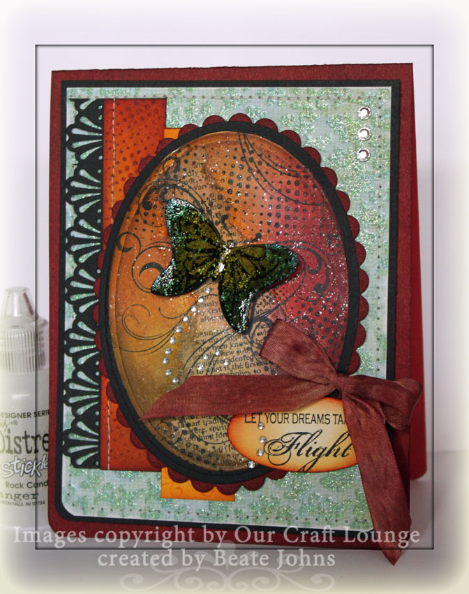
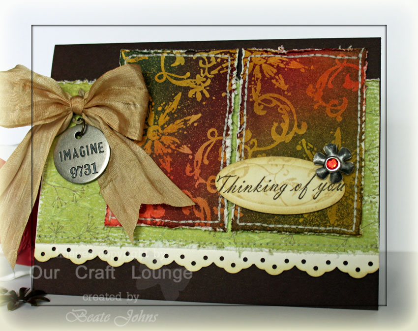
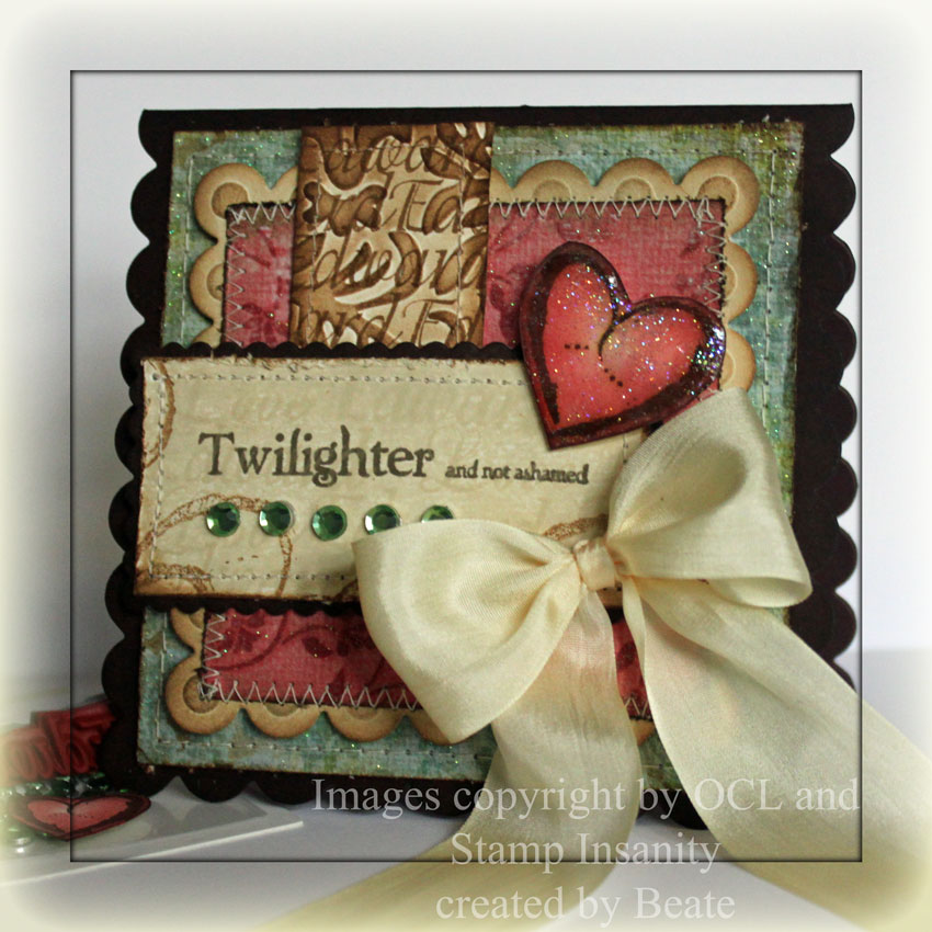
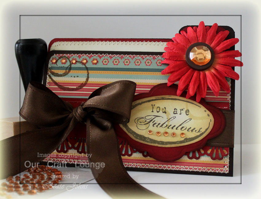
The card base is a 4 1/4″ x 11″ piece of Ruby Red cardstock. The edges were sponged with Aged Mahogany Distress ink and the bottom corners were rounded. A  3 3/4″ x 5″ piece of Laundry Line Designer Paper was stitched to a 3/16″ bigger piece of Basic Black cardstock.

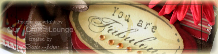
The horizontal layers started out as 7/8″ x 4 1/4″ piece of White cardstock. They were sponged and stamped. The black piece was punched with the Martha Stewart Deco Shell Border Punch. The sentiment was stamped in Jet Black Archival ink and punched out with Stampin’ Up!’s large oval punch. The edges were sponged first with Wild Honey, then with Aged Mahogany Distress inks. Tiny Tinkles were added as a flight tail behind the Butterfly.

The 1/2″ wide Silk ribbon started out in ivory. It was sponged first in Vintage Photo, then with Aged Mahogany. The dotted background was stamped all over the ribbon. After it dried it was tied into a bow with Bow-Easy and attached to the card with glue dots.

Thank you for stopping by. Have a wonderful Easter weekend! Hugs and smiles

oclvintagerosescanvaswide.jpg

I created this card for the OCL sketch challenge.

I started with adding some Sticky backed Canvas to neutral cardstock and cutting it out with large Label Nestabilities. Next I stamped the girl from Vintage Roses on the Canvas with Jet Black Archival ink. I colored her in with Worn Lipstick, Shabby Shutter, Antique Linen, Vintage Photo, Stormy Sky and Tattered Rose Reinkers and Brush, sponged the edges with Antique Linen and Vintage Photo Distress ink and layered it on a black layer cut with small Label Nestabilities.

I added some brown zig zag stitches and then sprayed the image with home made Pearly Mist. All you need to make the spray is Perfect Pearls Pearl and a water mister. Add some Perfect Pearl into you mister, fill with water and shake. Bam! Pearly Spray done. We played quite a lot with Perfect Pearls at Ranger U and I LOVE them! You don’t have to seal them with spray, just add water to bind them. How cool is that? I wish I could have captured the fine sparkles over the canvas in the photo.

ocldt06vintagerosescanvas.jpg

My card base is a 4 1/4″ x 11″ piece of Chocolate Chip cardstock, folded in half and sponged with Walnut Stain ink around the edges of the card front. It is followed by a slightly smaller piece of distressed Ivory Cardstock, topped with My Mind’s Eye Bellezo Paper. The horizontal and vertical strip are both from the same paper pack.

The red layer behind the lady measures 2 7/8″ x 3 1/2″. It was stamped with Vintage Swirls in Walnut Stain ink, distressed, sponged and stitched. The vertical strip was stamped with a stamp from Tim’s Mini Muse stamp set(oh yeah…I got me some Tim stamps. You can’t go to Ranger U and not fall in love with those!). The strip was distressed and sponged with Walnut stain. The horizontal strip was sanded, sponged with Vintage Photo and a white strip was added, that had been cut with Eyelet Borderabilities. The sentiment from Vintage Roses was stamped in Walnut stain.

To the bottom left I added a sponged Prima Daisy Doodles with a Stampin’ Up! Corduroy button in the center. The button started out Sahara gray and was sponged first with Vintage photo, then with Walnut Stain Distress inks. The chipboard swirl is from Maya Roads and was covered with Lettuce Dimensional Pearls.

I hope you have a wonderful Friday! We received about 3″ of snow tonight. The roads were quite treacherous this morning. But the sun is shining and hopefully the snow will melt away again today! I am ready for spring.

Thanks for stopping by! Hugs and smiles

oclnostalgicflowerswi2.jpg

I created this card for Our Craft Lounge’s Sketch challenge that was posted last Friday. The background was created with a technique Tim calls Nostalgic Blended Batik. It is a bit like the Emerging color background, but instead of stamping images underneath, you sponge different colors and you iron off the embossing powder at the end.

oclnostalgicflowersbeate2.jpg

My card base is a 5 1/2″ x 8 1/2″ piece of Chocolate chip cardstock folded in half. The edges of the card front were sponged with Walnut Stain Distress ink. As you probably already noticed, I like sponging my cardstock. I think it creates a richer look and I LOVE that.

The horizontal strip measures 2 5/8″ x 5 1/2″ and is from My Mind’s Eye Penny Lane collection. The long edges were sanded and distressed and sponged with Antique Linen Distress ink. A white strip of cardstock was added under the lower edge. It had been punched with Stampin’ Up!’s Eyelet Border Punch.

My panels started out as one 3″ x 4″ piece of Neenah Solar White cardstock. It was sponged with Wild Honey, Shabby Shutter and Worn Lipstick Distress ink and then heat set. Once it was dry I stamped the Flower from Nature’s Notes and the Flourish from Vintage Swirls in Embossing ink all over the panel. They were embossed with Clear Embossing powder. Once the embossing powder cooled, I swiped Chipped Sapphire, Forest Moss and Aged Mahogany over my panel. The cardstock was placed between Newsprint paper and ironed over to take off the embossing.

The sentiment is from Nature’s Notes. It was stamped in Walnut Stain on White cardstock. It was cut out with Petite Oval Nestabilities. A swirl from Vintage swirls was stamped over the sentiment in Antique Linen and the edges were sponged with the same color. A Foilage flower centered with a red rhinestone brad finish of the sentiment.

The ribbon started out as Ivory May Arts Silk Ribbon. I filled a mini mister with water and a bit of Vintage Photo Distress re-inker and sprayed the ribbon with it to dirty it up a bit. The ribbon was dried, tied and adhered with a glue dot over a Philosophy Tag.

jr-megamarch-blog-hop-day-3.jpg

P.S.: Sorry about yesterday. I hope the blog as well as Splitcoast will stay up and running today. Also crossing my fingers that most glitches are already caught and that the sites will run smoothly.

Make sure you check out the big JustRite Blog hop that’s going on right now. Prizes will be giving away on each of the three blog hop days. Make sure you stop by participating blogs and comment there. I will post  my card…along with a video tutorial tomorrow.

Have a great day! Thanks for stopping by! Hugs and smiles

oclflourishdaywide.jpg

Yesterday’s Inspiration challenge on Splitcoast took us to the Cutest Food website. We were to pick one image and create a project inspired by that image. I picked this gorgeous cake. I had received some of Our Craft Lounge newest releases before leaving for New Jersey and was itching to use them on a card.

oclflourishdayic224beate.jpg

My card base was cut with the largest of the Label 1 Nestabilities (one of my favorite Label shapes still….) out of Chocolate Chip cardstock. The edges were sponged with Walnut Stain Distress ink. The next layer is the next label down cut out of Neenah Solar White cardstock.

The long swirl from Vintage swirls as well as the sentiment from Spring Sketches were stamped in Walnut ink and embossed with clear embossing powder. I love that the Distress inks stay wet long enough to emboss them! One of the many reasons I love them. Gold Satin May Arts ribbon was wrapped around the top of the swirl layer and tied with a waxed linen thread on the left.

The flower was created with scallop and 1 3/8″ and 1″ circle punches. I punched several of each shape, sponged them with Aged Mahogany Distress inks, distressed the edges and then adhered them together. The first scallop was left as is, from the second and the third I cut one/two scallops out and adhered them together like cones. I did the same with the circle punch-outs to give my flowers some dimension. Last I rubbed Rock Candy Distress Stickles over my rose. It was adhered to the card front with several layers of dimensionals.

The inside of the card has another white label 1 cut out with swirls on the bottom.

I hope you had a great weekend! Mine was quite productive. I worked ahead and created two videos that I will share later…after they came out in the weekly inkling. Thanks for stopping by.

Have a great week! Hugs and smiles

Valerie Stangle wrote today’s tutorial on Splitcoast. She is showing us how to make this tag box. Make sure to check it out and leave her a comment on her video. It’s her first one ever.

tagboxnewsletter.jpg

Have a wonderful day! Hugs and smiles

sparklytwilightlovewide.jpg

Today the New Moon movie is coming out. The kids and I have been waiting for it to come out since we came out of the Twilight movie. I LOVED the books! I need to reread them badly. I has been over a year.

To celebrate the release of the second movie Twilight Tuesday is hosting a HUGE blog hop. Make sure you head on over and check out the list of the 53 blogs that are participating.

newmoonlogo1.jpg

For my card I used Our Craft Lounge‘s Love Notes as well as Stamp Insanities Otherwordly Loves.

My card base was cut with the Clear Scallop Square Big shot die from Stampin’ Up! out of Chocolate Chip cardstock. It was sponged with Walnut Stain ink.  A 3 7/8″ square of Coastal – Curious Double Take paper was distressed, sponged with Vintage Photo ink and stitched to the card base.

sparklytwilightlovewsc107.jpg

A 3″ square of Sundress paper was stitched to a Vanilla cardstock piece that was cut and embossed with Square Nestabilities and  sponged with Vintage Photo ink. The vertical layer is 1 1/8″ wide. The word Edwards was stamped all over in Vintage Photo ink. Next it was embossed with the Victoria Cuttlebug Folder, sponged with Vintage Photo ink and stitched around the edges.

The main panel is a 1 3/8″ x 3″ piece of Very Vanilla cardstock. It was first stamped with the solid background from Love notes in Antique Linen ink. That was overstamped alternating with the word Love from Love notes, and Edward from the Otherwordly Loves set. It’s barely visible, but it adds just enough texture to the panel. The sentiment was stamped in Walnut Stain ink. The panel was layered on a sponged scallop long Chocolate Chip rectangle cut with Nestabilities.

I added a Cream Silk Ribbon bow on the bottom right of the panel and Kaiser Rhinestones underneath the sentiment. To finish off the card, I stamped a heart from Love Notes in Walnut Stain,  sponged it with Fired Brick , cut it out, added Crystal Effect and Dazzling Diamond glitter.

Make sure you check out the other Twilight blog posts! As much as I LOVE the books and the first movie, I won’t be going to the theater today. I never go the first week. I don’t like overcrowded theaters.

Please check my previous blog post for a chance to win Our Craft Lounge‘s new Love Note set. All you have to do is leave a comment at the previous post.

Have a wonderful day! Hugs and smiles

oclmatchbookwide.jpg

Today is a BIG day! Our Craft Lounge‘s new sets are released today and to celebrate that there will be a blog hop. Make sure you visit each blog and leave a comment. You can win one of the new sets on each blog!!! The blog hop ends at midnight CST.

love-notes.jpg

You can win the set Love Notes on my blog. I love that set. The swirl, the backgrounds, the gorgeous hearts….I love them all.

For my sample, I created a matchbook candy holder. I missed making a sample for this great tutorial Theresa wrote during our Holiday Blitz. Surprise, surprise…..I used Chocolate Chip cardstock as my matchbook holder base. The edges were sponged with Walnut Stain ink.

oclmatchbookbeate.jpg

The 2 1/4″ square of Sundress paper was distressed, sponged with Vintage photo ink and sewn to a 1/4″ bigger piece of Vanilla Cardstock that had been sponged as well. A 1 1/8″ x 1 1/2″ piece of Coastal – Curious Double Take paper was distressed, sponged and adhered to the left hand side. Small clear Kaiser Rhinestones were added. The layers were attached to the matchbook with Scor-Tape.

Cream Taffeta Ribbon was tied around the matchbook. Next I punched a scalloped circleout of Chocolate Chip cardstock and sponged the edges. I attached it over the ribbon and small paper piece with dimensionals. For the circle center, I stamped the solid background of Love Notes in second generation Vintage Photo, then added the script background in full Vintage Photo. I punched out a 1 3/8″ circle, distressed the edges and sponged them with Vintage Photo. Last I added a stitched edge.

I stamped the heart in Walnut Stain, cut it out, sponged it first with Fired Brick, then with Walnut Stain ink. I attached it with dimensionals over my circle, then added Crystal Effect and sprinkled Dazzling Diamond Glitter over it. The sentiment is from the new set The Journey. It was stamped in Walnut stain, punched out with the small oval punch and sponged with Vintage Photo ink.

oclmbookinsidebottom.jpg

I covered the side behind the pocket with Vanilla/Sundress layers that mirrored the ones on the front. The pocket was covered with a piece of Coastal – Curious Double Take paper. Three Clear Circle Rhinestone Bradshold the pocket to the matchbook (along with more Scor-Tape). I punched out a half circle out of the top of the pocket with the 3/4″ circle punch to make it easier to get to the chocolate. 🙂

oclmbookinsidetop.jpg

The inside top flap was layered with a 2 3/4″ square of Very Vanilla cardstock. It had been sponged with Vintage Photo ink. The swirl from Love Notes was stamped randomly on the edges with the same ink. A 5/8″ x 2 3/4″ strip of the Coastal paper was added to the lower edge of the square and partly sewn on.

A small heart was stamped, colored and treated like the big heart in the front and adhered to the flap with dimensionals to finish it off. Please excuse the bad quality of my pictures. It was dark when I took them. I usually only photograph with natural light. But the last few days it was hard since it starting getting dark around 4:30 p.m. I miss the South!

Have fun blog hopping and checking out the other blogs.  Don’t forget to post at each blog for a chance to win! You can find a complete listing of the blogs on theOur Craft Lounge blog. Or check the list below!

Bird and Groom –Beth
Hang it Up Cupid – Carol, Vicki
Hearts & Hugs – Holly, Joy
The Journey – Charmaine
Life is – Amber
Love notes – Heather, me
Out for a spin – Pam
Fairy Dust is a must – Broni, Cami
Grandma’s Truffles – Val
Jungle Love – Deb, Kendra
Shamrock Blessings – Cindy
Sweet on you – Kisa
Wanted – Lila

Come back at 9:00 a.m. for another blog post. I know…ambitious me. I am in two blog hops today! Good luck with winning the OCL sets.

Hugs and smiles

 ocllifeisfilefolderwide.jpg

I got to play with three gorgeous new sets from Our Craft Lounge a little bit ahead of time. The release is tomorrow. Make sure you come back for a chance to win a set.

Check them out. I LOVE these new sets. Lots of elements and scrapbook stamps. Since I didn’t have time to get new photos of the kids to create a mini book, I decided to make a file folder card. I haven’t made one of those in  a while.

ocllifeisfilefolderbeate.jpg

I started out with a 5 1/4″ x 7 1/2″ piece of Chocolate chip cardstock. It was scored at 4″. The patterned paper is from the Early Bird paper pack from Cosmo Cricket. The swirl on the top left was stamped in Vintage Photo and is from the new set Love Notes .

Over the patterned paper is a 1 1/2″ x 5″ strip of sponged (with Fired Brick ink) Riding Hood Red cardstock that had been punched with one of the new Martha Stewarts Punch Around the page. May Arts Chocolate satin Ribbon was tied around it.

The sentiment is actually pieced together from the two elements/scrapbooking sets Life is and The Journey. First I stamped the oval frame in Walnut Stain ink, then added the sentiment pieces in the same color. Last I added the swirl from Love Notes in Scattered Straw ink. I hand cut the oval and sponged it first in Scattered Straw, then Vintage photo. It was layered on a Riding hood cardstock piece. It had been cut with Label 6 Nestabilities and sponged first with Fired Brick, then Walnut Stain ink.

ocllifeisinsidebeate.jpg

The card inside is created with sponged Riding Hood Red and Very Vanilla cardstock. The neutral cardstock had been sponged with Old Paper Dsitress ink. The swirls were stamped in the same color. The sentiment was stamped in Walnut stain ink.

The Flower was created by adding two Red Prima Daisy Doodles on top of each other, then a Basic Grey Button, which was topped off with a large Kaiser Rhinestone.  To tie in the rhinestone I added smaller ones of the same color on the card front and the sentiment.

Here is a video for the visual learner:

[youtube]https://www.youtube.com/watch?v=HZMvLHDjW5E[/youtube]

Make sure to check out more sneak peek samples on these blogs:

Bird and Groom –Beth
Hang it Up Cupid – Lila
Hearts & Hugs – Holly, Kendra
The Journey – Charmaine
Life is – Charmaine
Love notes – Kisa, Joy
Out for a spin – Carol
Fairy Dust is a must – Kendra, Vicki
Grandma’s Truffles – Broni
Jungle Love – Heather
Shamrock Blessings – Pam
Sweet on you – Cami
Wanted – Kisa

oclwinterscenewide.jpg

For the last Flower Soft Review I shot a video on how to apply Flower soft to stamped images. I used Polar White Flower soft, my favorite color.

oclwinterscenefsbeate.jpg

The card base is a 5 1/2″ x 8 1/2″ piece of Chocolate Chip cardstock folded in half. A 3 3/4″ x 5″ piece of Merry Days of Christmas paper from My Mind’s Eye was stitched to a 1/4″ bigger piece of White cardstock and adhered to the card base.

The image is from OCL’s Tweet Winter Wishes. It was stamped on Kraft cardstock in black Memento ink and colored with Copic Markers. The image was cut with Label eight Nestabilities. The edges were sponged with Snow Cap Adirondack ink. I also sponged white pigment ink where I wanted to add Flower Soft. White Flower Soft is a bit translucent. To make it look white on Kraft cardstock, it’s better to add white ink underneath.

The sentiment was stamped with Black memento ink on White cardstock. It was punched out with the small oval punch, the edges were sponged with Willow Dye ink from Adirondack.

Here is a quick video for the visual learner:

[youtube]https://www.youtube.com/watch?v=wXVA0Lerphk[/youtube]

Todays tutorial on Splitcoast is about adding Texture to your Copic coloring.

You all know I went to the Copic Class in Pensacola a month ago. Marianne Walker is amazing and shared some great tips with us. I passed some of them on in this tutorial.

ocldraketexturebeate.jpg

I started by stamping this adorable dragon from Our Craft Lounge in Tuxedo Black Memento ink on Neenah White cardstockand coloring him with  Copic Markers.

(Dragon: YG00, YG23 and YG25; Rocks: W1 and W4; Flowers: Y35, YR04 and R27; Grass: G24, Ground: E34 and E37, Sky: BG10)

The texture was added with the Blending Pen.

The image was layered on a Black Scallop rectangle cut with Nestabilities. On the upper left I added a Jumbo Pewter Eyelet with Riding Hood Red Ribbon and a Clear Rhinestone brad. The upper right hand corner was paper pierced.

The card base is a 4 1/4″ x 8 1/2″ piece of Chocolate Chip cardstock folded in half. Next come a 4″ square in Basic Black and a 3 3/4″ square in Pumpkin Pie. The 2″ x 3 3/4″ strip of designer paper is from the Flock Together paper pack. It was sanded and the bottom paper pierced.

I stamped the sentiment and eggs on Neenah paper in Tuxedo Black, colored the eggs in the same colors as the dragon and punched it out with the 1 1/4″ circle punch. The sentiment was first layered on a 1 3/8″ Chocolate Chip circle, then on a retired Pewter Hodgepodge Hardware piece.

ocldraketextureinside.jpg

I kept the inside very simple and the layers similar to the outside.

I am sorry for another late post. My Internet was down this morning. Something is wrong with the splitter. I didn’t even know we had one sitting where it is. I felt like McGuyver (and hopefully not like McGroover) messing with it so at least we can have Internet, if not TV. I need to buy a new one of those things.

Have a wonderful day! Hugs and smiles

© 2012 fresh & fun Suffusion theme by Sayontan Sinha